 I-Team: Generics Not Always the Same as Brand Name Drugs
We have a whole slew of ways to highlight words and phrases in documents, but sometimes we need to put emphasis on a difficult word or concept that’s not printed on a sheet of paper.
When it’s absolutely vital to get a concept across, I like to put text on the screen to reinforce the idea.
Here’s a quick compilation of this method:
The goal here is to send a small wake up call to the viewer. Here we’re using visuals to say-
This is important!
Pay attention!
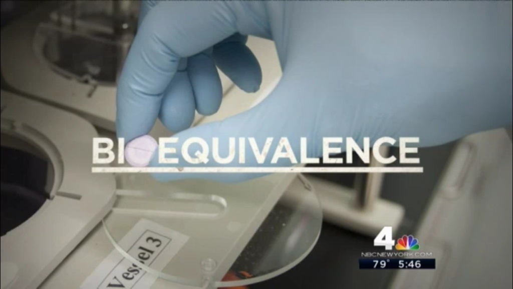
Take the BIOEQUIVALENCE example. The word BIOEQUIVALENCE is an incredibly important part of that story, but we struggled in the decision to use it because it’s a very technical term. The risk there is that a viewer would spend time thinking about what the word means and miss parts of the story.
Ultimately the term stayed in the script.
When it came time to edit that section I thought that marrying the term with the lab photo of the pill would help link the two in the viewer’s mind. This way, even if they don’t get the full concept, they’ll associate the word with the pills, and not wonder if it pertains to another area of medicine.
In the end, throwing text on the screen is a judgement call. It’s easy for that to quickly get old, and turn into an editing crutch. If you start doing it in the wrong places, you’ll distract the viewer and take their eye off of the ball.
My main advice for when you try to tackle this is to keep it simple.
In these examples, I kept to the typeface that’s used in our graphics package. I (mostly) kept the colors neutral, and laid off of effects like outlines or shadows.
What’s great about this effect is that it’s easy to implement. You can do something clean and effective right on the timeline of your edit system. There’s no need to jump into a heavy graphics package to pull this off.
Questions? Comments? Tweet me: @evan4ny